Hua Soap Company
Rebranding, packaging redesign
Project Objectives
Re-brand Hua flower soap to appeal to a younger demographic and
re-design packaging to make it more environmentally friendly.
Target Audience
Canadian women 20 to 30 years of age seeking inexpensive soap with an elegant fragrance.
Research
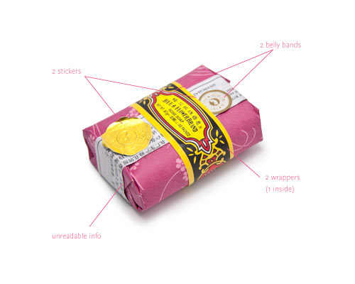
The current logo has a very Oriental look, but feels slightly dated and appeals to an older
demographic. The packaging was overdone; it had too much information that was difficult
to read, two belly bands and several stickers.
Insight/Concept
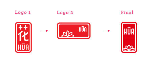
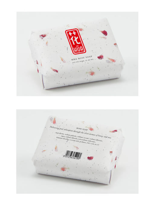
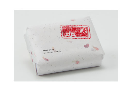
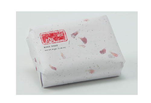
It was important to keep the Oriental feel with a respectful nod to tradition. I modernized the logo,
removed the Chinese characters and used a flower symbol in a red Chinese stamp to convey the soap’s
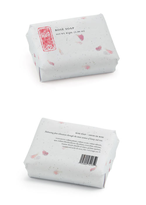
Eastern origins. To improve the product’s environmental appeal, I kept packaging to a minimum,
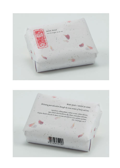
eliminating layers, using only a single wrapping of re-plantable seed paper. The information on the package
is also minimal: logo, product name, net weight, product description, and ingredients.
Logo Ideas
Packaging Ideas
Process
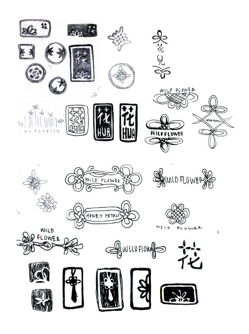
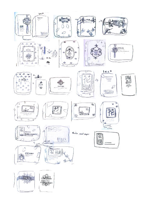
For the overall design I went through many different phases trying out different ideas such as relating it to
Chinese knots and Chinese watercolor paintings. In the end I chose the simple stamp and seed paper idea.
In the initial logo redesign, I had a Chinese character as a stamp with the English on the bottom, but this
was confusing so I decided to change it to the flower. For the packaging I created many different layouts
with various alignments; some were too bland, other inelegant. In the end I utilized a left alignment in the
front, right next to the logo. I made the back right aligned to keep it looking interesting. For this project I
started with a moodboard and then I created thumbnails for the logo. When I had a logo chosen I
continued with thumbnailing the packaging layout. Next I photographed the product and created mock ups
to finalize the project. The outcome was a simple, elegant and oriental soap that is both feminine and
environmentally friendly.
Packaging Stage 1
Packaging Stage 2
Packaging Stage 3
Packaging Stage 4
Final

Something to Say?