
Colors
When it comes to creating a brand, I always identify the CMYK, RGB, and Pantone colors for my client’s brand. This of course includes creating the logo files in all the different color settings. Sometimes this can end up being 20-40 files for just one brand! Such as logo icon, logo in horizontal orientation, logo in a stacked formation in black and white, and color in CMYK, RGB, Pantone Coated, and Pantone Uncoated. Having all these files, can help my clients to reinforce their brand image in all sorts of outlets. However, for someone who may not understand the difference these color systems or what they are used for, opening all these logo files can feel very overwhelming. In order to help you use all these different file types, I want to summarize what each of these color systems are and what they are commonly used for.
CMYK
CMYK stands for Cyan, Magenta, Yellow and Black—the colors used in printing. While it may not be obvious, prints from home computers or print shops uses Cyan, Magenta, Yellow and Black to create all the colors of the spectrum. This is created with many tiny dots that blend to create the colors that you want to see, such as red, teal, or purple. CMYK is very commonly used and can be applied to all print products such as stickers, art prints, business cards, ads, flyers, packaging and other print material.
RGB
RGB stands for Red, Green and Blue—these are the colors your computer screen uses to create the colors that you see on your screen. Naturally, RGB is used for all web related materials such as web banners, websites, web ads, apps, and other digital material. RGB colors are much more vibrant compared to CMYK which can be difficult to reproduce in print material. In some situations, RGB colors are used for print, such as with photo printing.
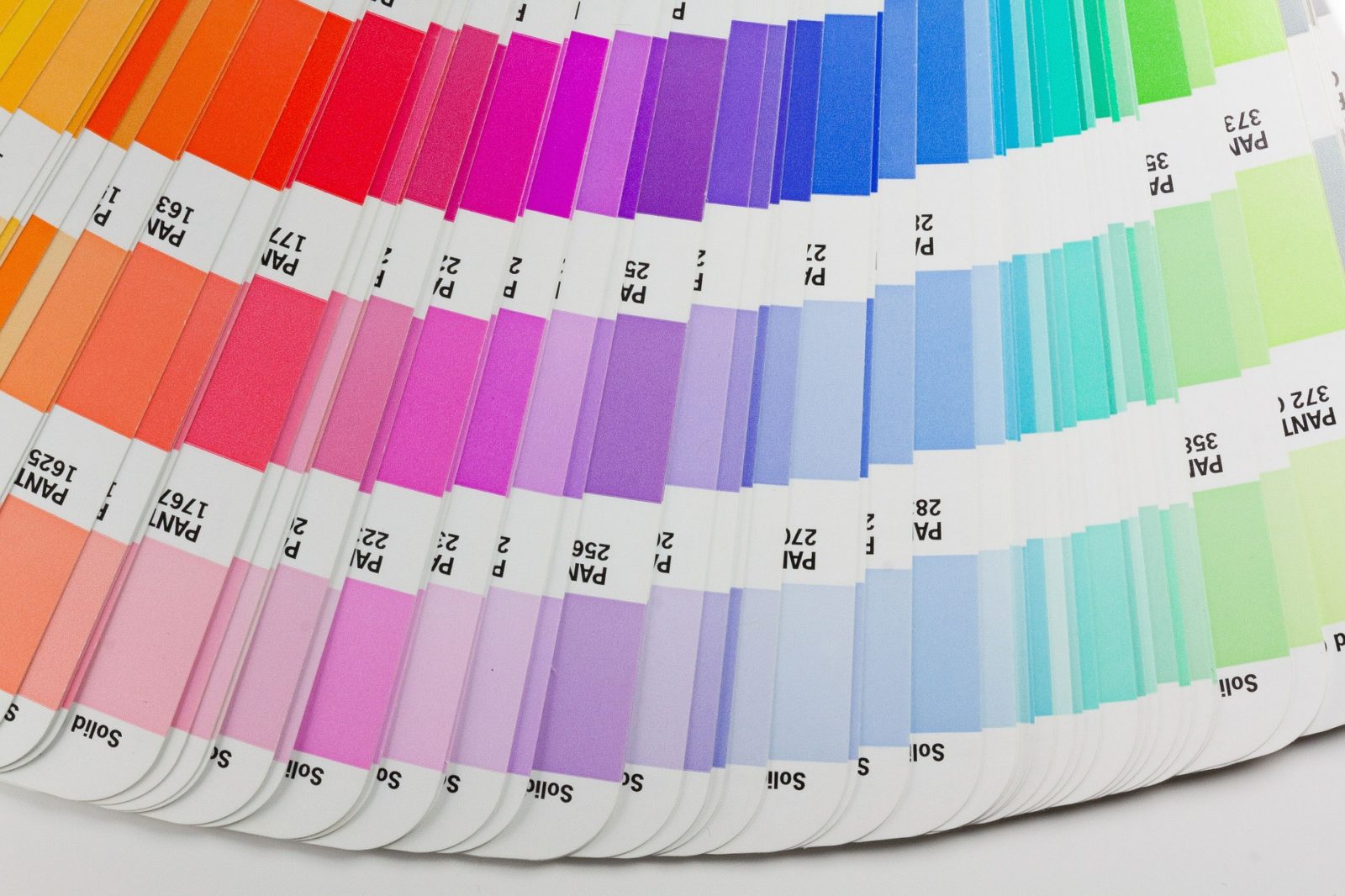
Pantone Colors
Similar to CMYK, Pantone colors are also used for print. However, Pantone colors are much more specific. In fact, Pantone is a standardized color system, meaning its colors can be matched globally. When you use a Pantone color for print, the colors you specify in your print file is custom made for your printing needs. This means that no matter where you print, your files will always come out the same. This is especially useful when creating brand material because a brand’s color plays such an essential role in presenting the brand’s personality and creating a memorable experience for the audience. It is important to note that there are also different types of Pantone colors, such as coated and uncoated. Pantone coated colors are used for printing with a coated paper that looks shiny or glossy, whereas uncoated refers to an uncoated paper. While the formulas for the same colors in coated and uncoated remain the same, they will appear differently on coated and uncoated paper. In this case, it is important to identify which coated and uncoated colors match the brand’s colors the best because they may or may not be the same color code. Universal Printing provides a much more indepth explanation of coated vs uncoated which can be found here.
The Difference
In many cases, printing with the wrong color system(printing rgb) or posting a web post in the wrong color system (cmyk or pantone) will not make a big difference because the colors will be converted according to its output. However, this may cause the colors to shift slightly making it appear more dull or simply less accurate to your brand’s true colors.
So why does this matter?
Many people who don’t understand the differences between CMYK, RGB, and Pantone colors often resort to using only one set of the colors. Usually this is RGB because it looks the most “correct” on screen. This is because CMYK and Pantones which are made for print, are being recreated with your screen’s color display which are not exactly accurate. Actually, it often looks kind of weird. While it may not be catastrophic to print in the wrong color system, you might look at your products and think This didn’t turn out like I thought it would… or Why doesn’t it look like the colors that I chose? In this case, understanding the difference between the colors will solve your problem, simply print using the correct color systems and everything will be fine and dandy.
So now you might be wondering Why don’t I just print in Pantones all the time then? This is because since Pantone colors need to be set up on a printer according to your color choice, it will be a higher cost than printing in CMYK which are already built in to printers. While it does cost more, printing in Pantones will give you more accurate and more vibrant colors every single time you print no matter where you are in the world. This could be very useful if you’re printing something overseas, or if you’re changing print shops, or if you’re printing something very important that will reach out to a very wide audience.
While it may seem excessive to have such a wide array of systems, understanding what each offers can really take your brand to the next level. Not to mention how you can finally use all those extra logo files that you’ve already paid for instead of simply using one set of them. With that being said, there are still some rare occasions where people prefer the convenience of simply sticking to one system. At the end of the day, as long as you are happy with how your print or web items have turned out, that is all that matters. Hopefully this post will help clarify some confusion and help your brand be the best that it can be.
Ivyc
Comments
Graphics Standards Manual | Ivy Chan's Portfolio Site
[…] In the image above, we can see the different logo orientations: in this case there is only two, the primary logo and secondary logo which is more simplified. The simplified logo can be used in smaller formats where space is limited. In other brand GSMs there might be additional logo orientations such as stacked, horizontal, with icon, without icon, monogram, etc… Here we also see the recommended spacing and minimum sizing for the logo—this information can help keep graphic materials in line and on brand while also letting you know when the logo will become illegible. We’re also shown the brand pattern, and brand colors. The patterns may be used for background, or supporting graphic material in certain outlets—its usage may be something that will be defined in a brand book. As for the brand colors, we see a list of color values such as Pantone coated, Pantone Uncoated, Hex, RGB, and CMYK which I’ve briefly talked about in my previous blog post here. […]