

Graphics Standards Manual
When it comes to branding projects, most people outside of the graphic design industry only think of the company’s logo. What they might not realize is that the brand consists of much more: it includes the brand logo, brand colors, brand typography, additional graphics, tone of voice, brand personality and also how it is used in conjunction with other graphics or images. To define these different components of the brand, a graphics standards manual(GSM) or a brand book may be used.
But what’s the difference between a GSM and a brand book?
As the title states, a GSM defines the graphics standards, meaning anything that is visual. Typically, this would include the core visual elements of the brand such as the logo, additional logo orientations (horiziontal, stacked, simplified), icon, colors and typography. Depending on the brand, it may include the brand’s graphic patterns, additional supporting graphics and sometimes image use.
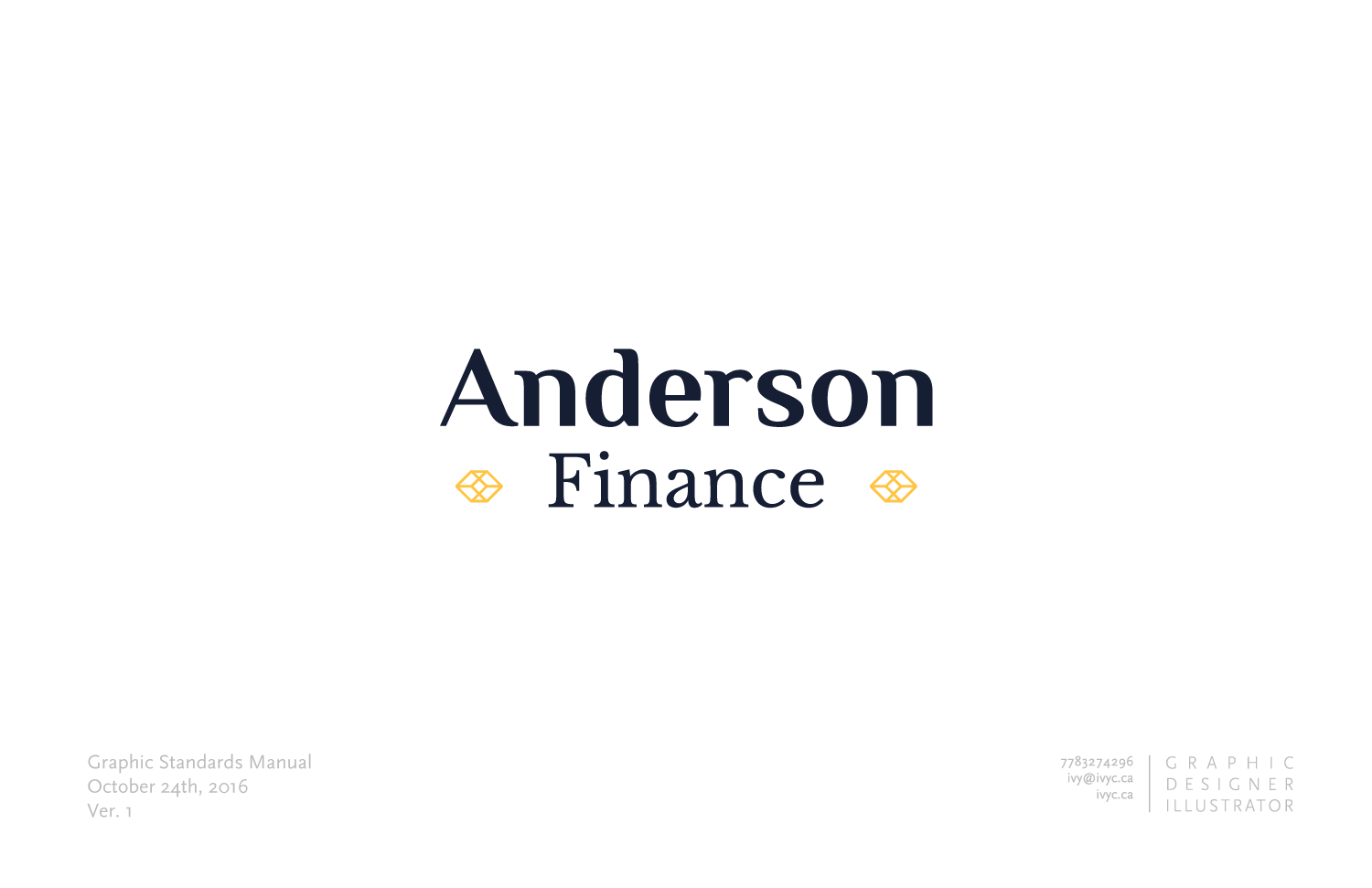
Please see below for an example of a fictitious financial advising company that I’ve created. The concept behind this brand is that financial advisors use their knowledge of finance, in addition to the understanding of their client’s existing financial state and future goals to act as the building blocks to guide them towards their ideal future. This concept is the meaning behind the two gold cubic icons on either side of the “Finance”. As for the word mark, it is a combination of both a modern serif typeface, and a rather traditional one to create a sophisticated, up-to-date, professional and reputable personality. It’s visual qualities are both bold and calm;and new and classic. The color scheme is a combination of a dark navy and bright golden yellow which gives the impression of a masculine and mature personality, with a touch of gold to represent financial success.
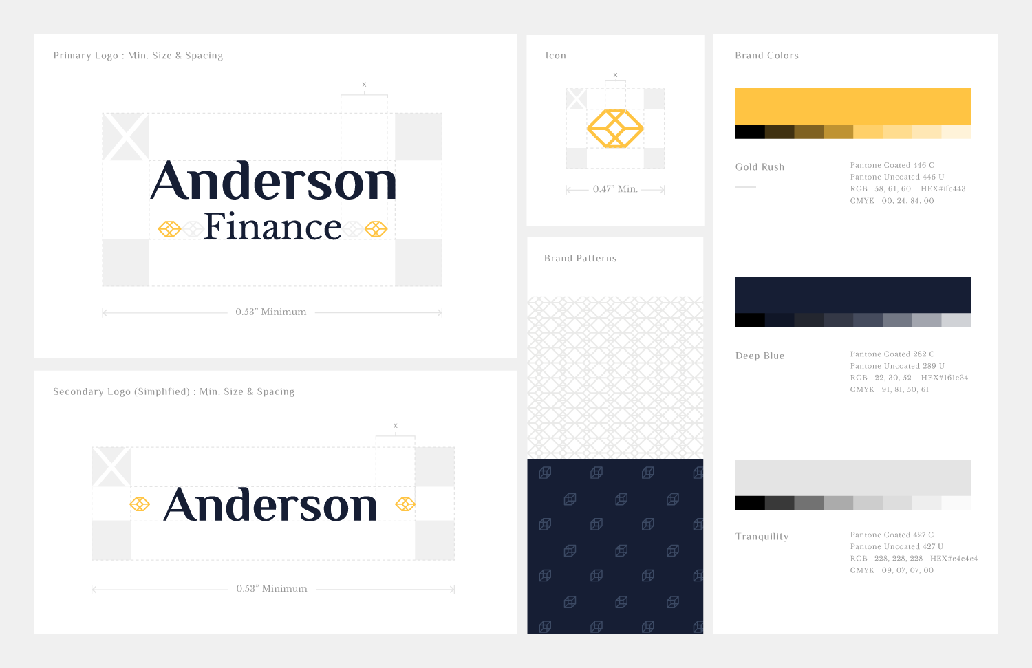
In the image above, we can see the different logo orientations: in this case there is only two, the primary logo and secondary logo which is more simplified. The simplified logo can be used in smaller formats where space is limited. In other brand GSMs there might be additional logo orientations such as stacked, horizontal, with icon, without icon, monogram, etc… Here we also see the recommended spacing and minimum sizing for the logo—this information can help keep graphic materials in line and on brand while also letting you know when the logo will become illegible. We’re also shown the brand pattern, and brand colors. The patterns may be used for background, or supporting graphic material in certain outlets—its usage may be something that will be defined in a brand book. As for the brand colors, we see a list of color values such as Pantone coated, Pantone Uncoated, Hex, RGB, and CMYK which I’ve briefly talked about in my previous blog post here.
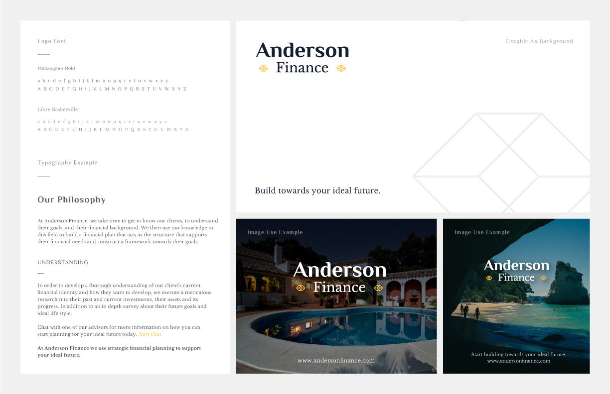
On this second page, the logo typography is defined, in addition to an example of how these typefaces can be used in a paragraph format with headers, sub-headers, and links. Finally, we also see the graphic used as a background, and how the logo can be used with images. Again depending on the brand, something like “graphic used as background” may not be necessary.
A brand book is similar, but much more elaborate. Apart from defining the brand’s visual elements, it also outlines the brand’s history, the brand’s personality, the brand’s key values, different logo orientations,logo color variations, and do’s and don’ts of logo use examples. In some cases, it can include much more. Of course this would depend on the project at hand and what the client needs or is requesting but it can also include: photography style, design layouts guidelines, merchandise applications, copywriting guidelines (tone of voice), website layout guidelines, supporting graphic guidelines and much more. The content of the brand book can vary, but it’s goal will be to act as an overall guideline towards different ways that the brand will “live”. For instance, if a certain brand tends to use a lot of billboard advertisements, it may be valuable to them to include a billboard layout guideline in their brand book. It could also expand on the information found in a GSM, such as defining the actual sizing proportion of the different type components and paragraph alignments based on usage.
Seems interesting, but do I need one?
This is a question I get a lot when I am doing branding projects. As a graphic designer I find GSMs very useful especially if I am creating material for a brand I did not design. In other words, if your brand intends to work with more than one graphic designer, or types of designer (such as interior designer or even web developers), they may find it useful to have a document to refer to when they need to know the exact brand color, or typography style to expand your brand through different outlets. This is why I tend to include one into all my project estimates, but in some cases, budget is limited or perhaps the client only needs a simple graphic made that they already had in mind or they only intend to make a sign or a limited amount of brand touch points (any material with branding on it), then in that case, maybe a GSM is not necessary. Of course, if further down the line they wish to create one, it can certainly be made. However, if your brand is one that uses a variety of different graphic components, it may be helpful to have a GSM or even a brand book to see how those function, otherwise if you only receive the graphic as a stand alone without any guidance as to how to use it, then they’re simply pictures on your computer. Learning how to bring your brand to life and how to keep that consistent can create a strong identity for your company.
Something to Say?